Candlestick Charts
Share
Candlestick Charts
Table of Contents
1. Overview
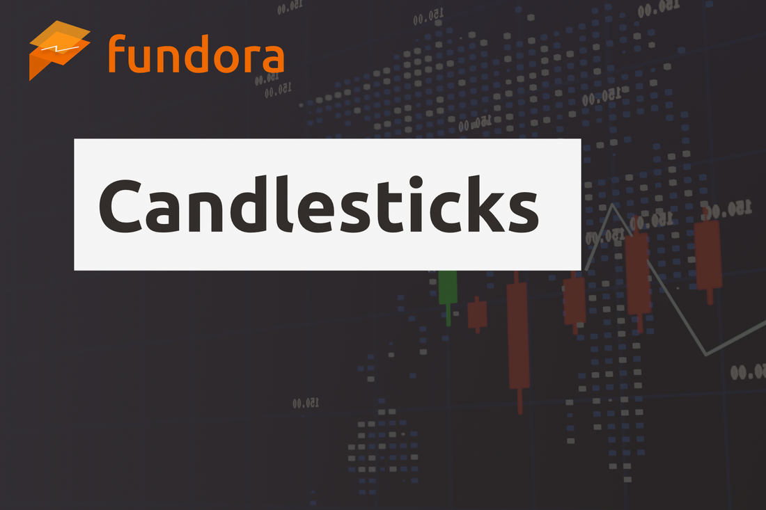
A candlestick chart is one of the most widely used chart types in financial markets, offering a visual representation of price action. Originating in Japan, it has been used for generations by traders. Each candlestick displays the open, high, low, and close prices for a specific time period, providing detailed insight into market movements over time.
2. Structure of a Candlestick
Each candlestick represents four key prices:
- Open – The first traded price in the period.
- Close – The last traded price in the period.
- High – The highest price reached in the period.
- Low – The lowest price reached in the period.
The body shows the range between the open and close, while the wicks (or shadows) indicate the high and low prices.
3. Types and Patterns of Candlesticks
Candlesticks form various patterns that traders use to anticipate reversals or trend continuations. Common examples include:
- Bullish Candle – Close is higher than the open, often shown in white or green, indicating upward momentum.
- Bearish Candle – Close is lower than the open, often shown in black or red, indicating downward momentum.
- Doji – Open and close are nearly the same, often signaling indecision or a potential reversal.
- Hammer & Inverted Hammer – Hammers often appear after a downtrend as a bullish reversal signal, while inverted hammers can appear after an uptrend, signaling potential reversal.
- Engulfing Patterns – Bullish or bearish engulfing patterns occur when a candle completely engulfs the body of the prior candle, suggesting a strong reversal signal.
4. How to Use a Candlestick Chart
- Confirming Trends – Multiple consecutive bullish candles suggest an uptrend; multiple bearish candles suggest a downtrend.
- Identifying Reversal Signals – Patterns like doji, hammers, or engulfing candles can mark turning points, helping to time entries and exits.
- Checking Support and Resistance – Combining candlestick patterns with support and resistance levels improves the accuracy of reversal or breakout assessments.
5. Advantages and Disadvantages
Advantages
- Visually Intuitive: Candlesticks provide a clear, easy-to-read picture of market sentiment.
- Clear Reversal Patterns: Specific formations give strong clues about potential reversals.
- Effective for Short-Term Trading: Especially useful for timing entries and exits in short-term trades.
Disadvantages
- Prone to Noise: Short-term fluctuations can produce false signals, especially in ranging markets.
- Requires Confirmation: Best used with other indicators like RSI or MACD for greater accuracy.
6. Practical Examples
- Uptrend Entry: When price rebounds from a low and forms a hammer or inverted hammer, it may signal the start of an uptrend and a potential buy entry.
- Downtrend Entry: When price reverses from a high and forms an engulfing or doji pattern, it may signal the start of a downtrend and a potential sell entry.
7. Summary
Candlestick charts are a powerful tool for visually understanding market price action, particularly useful for timing entries and exits in short-term trading. Mastering candlestick shapes and patterns can improve success rates, especially when combined with other technical indicators for confirmation.
8. Frequently Asked Questions
Q1. What is a candlestick?
A1. A visual representation of a period’s open, high, low, and close prices, providing a clear picture of market movement.
Q2. What’s the difference between a bullish and bearish candle?
A2. A bullish candle closes higher than it opened, showing upward movement. A bearish candle closes lower than it opened, showing downward movement.
Q3. Can I trade using only candlestick analysis?
A3. While candlesticks are powerful, they can produce false signals. Combining them with other indicators like RSI or MACD increases accuracy.